september 20

09-20-15 "worlds away"
09-20-15 “worlds away” —1 SOLD—

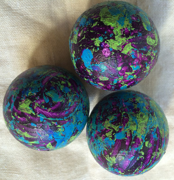
wooden balls, each 1.5″ diameter; acrylic paint

I bought a couple of bags of wooden balls at the Habitat for Humanity ReStore a few years ago. I painted some of them, and some are still only gessoed (and some are still raw wood). I’m not sure yet what I’m going to do with them, but I took three of the previously painted one-color balls and added some flourishes with three more colors. I like how they turned out, although I’m still not sure where they’ll end up. More pondering needed. For now, they’re my daily for today.

september 19

09-19-15 "stripes"
09-19-15 “stripes”

5×8″ acrylic, collage

This sketchbook page has scraped and manipulated acrylic paint (and some blockprinting with acrylic), and some postcard strips collaged over all of that.

september 18

09-18-15 "city of dreams, nightscape"
09-18-15 “city of dreams, nightscape”

10×8″ acrylic

This is an enhanced scraped painting. I took an old scraped painting that was in stand-by, then scraped some blues coming down from the top, and some strips of vibrant color coming up from the bottom. Some of the original painting shows through. To me, it just looked like a big city lit up at nighttime when I pulled the last scrape. What do you see?

september 17

09-17-15 "peachy"
09-17-15 “peachy”

9×11″ acrylic

This is a repurposed peach from long ago. It was a practice peach for a poem-painting, and I also had tried out different colored pens on top of the paint for writing the poem. For this daily, I painted over the penned words, cleaned up the edges, and added the background color (and barely visible painted lines, the final touch).

The original had an unpainted (whitish) background, and the painted peach edges were messy and sketchy. I actually liked it that way, in a way. I didn’t intend to clean up the edges quite so much, but once I added the blue-purple color in the background, the edges didn’t seem to work as well. I don’t love this yet, but sometimes that’s how it happens with the daily janes.

september 16

09-16-15 "revealing"
09-16-15 “revealing”

10×7.5″ acrylic on matboard

This began with a scrape of a variety of colors. After drying, I scraped a transparent acra blue violet over it, then cutting in lines with a soft scraping tool while the paint was still wet. I don’t think it needs the cut-in lines now, but thought it was a good idea at the time.

Even though acra blue violet is transparent, it is also dark and can cover up in the right thickness. I like how the colors pop through here and there, and those places where there wasn’t quite enough paint to cover over.

september 15

09-15-15 "ribbons of green"
09-15-15 “ribbons of green”

5×8″ acrylic

I scraped three colors of green on this sketchbook page, then took a soft scraping tool and dug into the wet paint to reveal the greens under the other opaque green layers. After it dried, I went in with a brush applying a transparent mix of zinc white and indanthrene blue around the edges and in the white spaces all over.

september 14

09-14-15 "twizzle jazz"
09-14-15 “twizzle jazz” —SOLD—

13.5×6.5″ acrylic

This is a scraped acrylic painting on a long, narrowish piece of matboard that has a “failed” painting on the back. I was planning to try some other techniques and paint after I completed the initial scrape, but I liked how this turned out without doing more so I left it as is!

september 13

09-13-15 "coneflower spikes"
09-13-15 “coneflower spikes”

digital photo

I’m using one of my backpocket photos of coneflower seedheads for my daily today (because it’s Sunday). I’ll say it again, I love transforming how we see a flower by zooming in close and letting us experience it anew.

september 12

09-12-15 "upside down?"
09-12-15 “upside down?”

5×8″ acrylic on sketchbook paper

This began with a little leftover scraping paint. Then I used a palette knife to apply three different colors of green over that. I added some magenta to balance out the forms created by the original scrape, but it looked incomplete and lopsided. I added more and more magenta in the cracks and crevices and white spots and more. Then I accidentally got paint on my finger and the paint got on the side of the page (unconnected to the existing paint) and it looked very odd. I tried to lift up the paint but it didn’t work. So, I went all in with a magenta background, adding some transparent yellow to change it up a little. This is the orientation I painted it, and I like it, but something makes me wonder if it is really upside down. I looked at it both ways and was pulled both ways. In the end, I stuck with the original orientation, although I’m not totally convinced. What do you think?

september 11

09-11-15 "walking monolith"
09-11-15 “walking monolith”

11.5×7″ acrylic, collage on matboard

I had the blue/purple “monolith” (on paper) already scraped and cut out. I was looking for colors that would make it stand out and also complement it. I took this piece of matboard and made a couple of different scraping passes with yellow/magenta/orange acrylic colors. When that was dry, I collaged the painted monolith on top.

And this: Fourteen years ago hijacked planes brought down the Twin Towers and destroyed many lives in NYC, DC, and Pennsylvania. The shock of it in the US lingers even today, although the numbers of lives lost pale in comparison to those who died in Iraq and Afghanistan—both US troops and Afghani and Iraqi civilians—as well as those killed in Syria and beyond. In the months after 9/11, I organized a project documenting Iowa artists’ responses to the terrorist acts (and beyond). It is a good day to revisit those responses by visual artists, musicians, writers, and poets.
www.beyond9-11.org
(Unfortunately, I have not had time to update the site to be mobile friendly, so try to view on a computer or large tablet….)